5 Applicant UX Mistakes That Kill Digital Health Screening Adoption
Five common applicant UX mistakes in digital health screening that drive insurance applicants away, with data on how to fix each one.
Most digital health screening tools for insurance don't fail because the technology is bad. They fail because nobody thought hard enough about what the applicant actually experiences. The applicant UX mistakes in digital health screening that cause the most damage are the ones that seem minor during internal testing but become deal-breakers at scale, when real people with real hesitations encounter them on a Tuesday evening while half-watching television.
LIMRA's 2025 Insurance Barometer Study found that 40% of American adults believe they need more life insurance than they have. The demand exists. The applications don't get finished. And in most cases, that gap comes down to five specific UX problems that carriers keep repeating.
A 2024 study from Cake & Arrow, an insurance-focused design consultancy, found that "mission friction" between internal teams produces the most damaging UX failures. When IT builds a screening tool to collect maximum data and product builds one to maximize completion, the applicant gets caught in the middle.
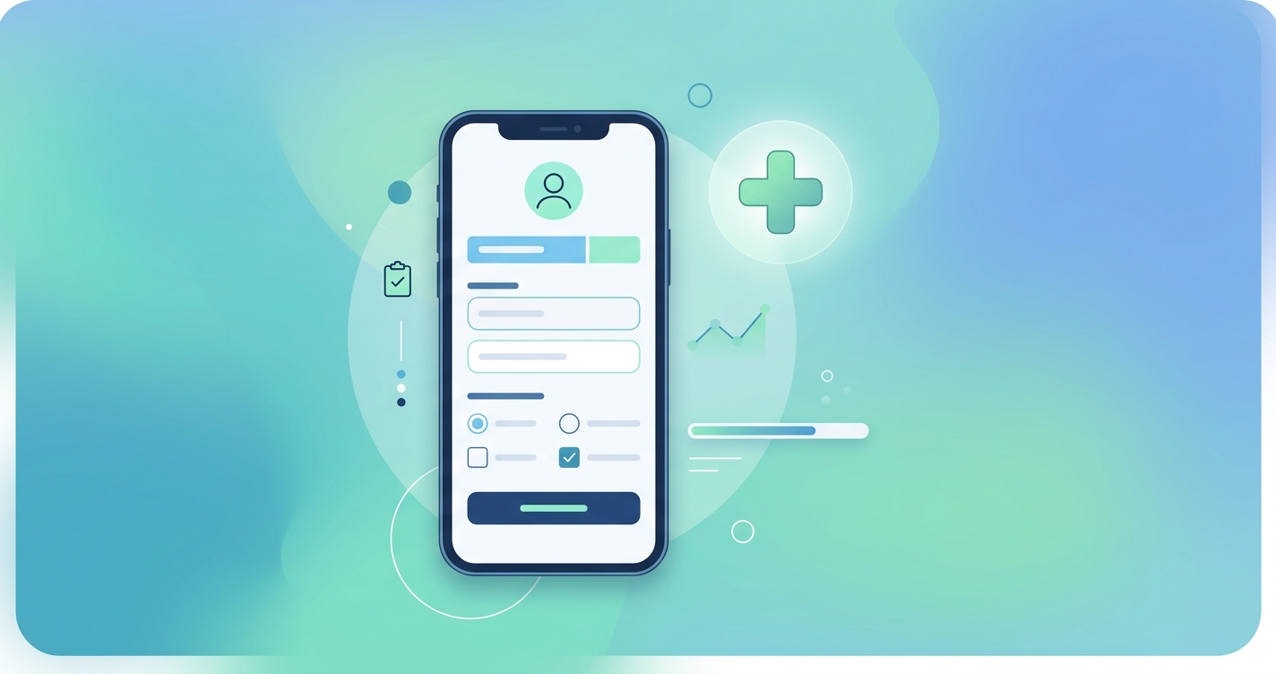
1. Asking for permissions before explaining anything
The single fastest way to lose an applicant is to hit them with a camera or location permission prompt before they understand why. Browser-native permission dialogs are blunt. They say "this site wants to use your camera" with no context, and the applicant's instinct is to click deny.
This matters more now than it did five years ago because contactless health screening, which uses the phone camera to measure vital signs through rPPG (remote photoplethysmography), is becoming standard in digital underwriting. The camera permission is the gateway to the entire assessment. Lose it, and the screening is dead.
Carriers that display a brief explanation screen before triggering the permission prompt see 60-70% higher grant rates than those that let the browser dialog appear cold. The explanation doesn't need to be long. Something like "We'll use your camera for a 30-second health scan. No photos are taken or stored." That's enough. The problem is that most implementations skip it entirely.
2. Front-loading lengthy medical questionnaires
Long medical history forms at the beginning of a screening process are a leftover from paper applications. Digitizing a 40-question medical history form doesn't make it a good experience. It makes it a bad experience on a smaller screen.
The drop-off data on this is consistent across multiple studies. Quantum Metric's healthcare analytics research and separate LIMRA digital journey analysis both show that medical history sections cause the second-highest abandonment rate in digital insurance flows, right behind the initial landing page confusion.
Part of the problem is terminology. Applicants encounter clinical language they don't understand and worry that answering honestly will disqualify them. So they close the tab.
| UX mistake | Typical drop-off increase | Why it happens | What to do instead |
|---|---|---|---|
| Permission prompt with no context | 30-40% camera denial rate | Browser shows generic dialog | Add a one-screen explanation before the prompt |
| Front-loaded medical questionnaire | 10-18% abandonment | Clinical terms scare applicants | Move health questions after the biometric scan, or replace them with it |
| No progress indicator | 8-14% mid-assessment exit | Applicant doesn't know how much is left | Show a simple step counter or progress bar |
| Email verification mid-flow | 8-12% abandonment | Breaks momentum, applicant forgets to return | Verify email after screening is complete |
| Generic error messages | 5-10% permanent loss | Applicant assumes they failed | Explain the problem and offer a retry path |
The more interesting question is whether these questionnaires are even necessary anymore. Biometric data collected through a camera-based health scan can replace several self-reported data points. Blood pressure estimation, heart rate, respiratory rate, and stress indicators can all be captured in under a minute without asking the applicant to type anything. That doesn't eliminate every question, but it reduces the form length enough to change the experience.
3. Hiding the progress bar (or not having one)
This one seems trivial. It isn't. A 2024 analysis from the Baymard Institute, which maintains a large-scale benchmark of e-commerce and application UX patterns, found that multi-step forms without progress indicators have measurably higher abandonment rates than those with them. The effect is psychological. When people don't know how many steps remain, they assume the worst.
Insurance screening is especially vulnerable to this because applicants already expect the process to be long and painful. Traditional underwriting has trained them to expect weeks of back-and-forth. A digital screening that feels endless, even if it only takes three minutes, confirms their suspicion that nothing has really changed.
The fix is straightforward. Show a step counter. "Step 2 of 4" works. A progress bar works. Even a simple "Almost done" message at the right moment works. What doesn't work is a blank screen with no indication of where the applicant stands in the process.
What progress indicators actually affect
The research from Baymard suggests that progress indicators don't just reduce abandonment. They change how applicants perceive the experience afterward. People who complete a screening with a visible progress bar rate the process as faster and easier than people who complete the identical screening without one, even though the actual time is the same. That perception matters for Net Promoter Scores and for whether the applicant recommends the carrier to others.
4. Breaking flow with email verification loops
Requiring email verification in the middle of a health assessment is like asking someone to park their car halfway through a drive-through. The applicant has momentum. They're answering questions, they're engaged, and then the system tells them to go check their inbox for a six-digit code.
Some come back. Many don't. The data on mid-flow verification interruptions is consistent: 8-12% of applicants who leave to verify email never return to complete the assessment. The verification email sometimes lands in spam. The code expires. The applicant gets distracted. The session times out.
The alternative is simple. Collect the email address early, verify it after the screening is complete. The applicant has already invested time in finishing the assessment, so they're more likely to follow through on a verification step at the end. Or use a phone number and send an SMS code, which keeps them on the same device.
RGA's 2024 digital disclosure research, led by Daniel Schömer and Christoph Krammer, drew a distinction between "positive friction" and "bad friction" in insurance applications. Positive friction is a verification step that improves data quality. Bad friction is an administrative task that interrupts the applicant's engagement without improving the underwriting outcome. Mid-flow email verification is almost always the latter.
5. Returning generic error messages when something goes wrong
Camera-based health screening involves real-time signal processing. Sometimes the lighting is wrong. Sometimes the applicant moves too much. Sometimes the phone's front camera isn't good enough. These are recoverable problems, but only if the system communicates them clearly.
The default approach in most implementations is a generic error message: "Something went wrong. Please try again." This tells the applicant nothing. They don't know if the problem was their fault, the system's fault, or permanent. Many assume the worst and leave.
Better error handling looks like this:
- "The lighting seems too low. Try moving closer to a window." (specific, actionable)
- "We detected some movement. Hold your phone steady for 30 seconds and we'll try again." (explains the cause)
- "Your scan didn't complete. This happens sometimes. Tap here to retry." (normalizes the situation)
The difference between a generic and a specific error message can be the difference between a retry and a permanent loss. J.D. Power's 2025 Insurance Digital Experience Study found that error recovery is one of the strongest predictors of overall digital satisfaction in insurance. Applicants don't expect perfection. They expect the system to help them fix problems when they occur.
How these mistakes compound
These five problems don't exist in isolation. An applicant who hits a confusing permission prompt, then faces a long questionnaire, then encounters a generic error message isn't three times as frustrated. They're done. The cumulative effect of multiple UX failures is exponential, not additive.
McKinsey's 2025 insurance technology analysis estimated that carriers with optimized digital application flows convert at 2-3x the rate of those using legacy digitized processes. The technology underneath can be identical. The difference is whether someone thought carefully about the sequence of screens the applicant actually sees.
The cost of getting it wrong
Each abandoned screening has a concrete cost. The carrier spent money to acquire that lead through marketing or agent referral. The applicant was interested enough to start. And then something in the UX pushed them away. For carriers processing thousands of applications monthly, even a 5% improvement in screening completion translates to significant revenue.
| Metric | Industry average (legacy UX) | Optimized digital UX | Difference |
|---|---|---|---|
| Screening completion rate | 55-65% | 78-88% | +20-25 percentage points |
| Time from start to policy issue | 15-25 days | 1-3 days | 85-90% reduction |
| Applicant satisfaction (post-screening) | 3.2/5 | 4.1/5 | +28% |
| Cost per completed screening | $45-75 | $18-30 | 50-60% reduction |
Current research and evidence
The research on digital insurance UX has expanded considerably since 2023. LIMRA and LOMA's Technology Solutions Conference in 2025 dedicated multiple sessions to applicant experience design, reflecting the industry's growing recognition that technology alone doesn't solve underwriting friction.
Cake & Arrow's B2C/B2B/B2B2C insurance friction report (2025) introduced the concept of "mission friction," where misalignment between internal stakeholders produces contradictory UX decisions. Their recommendation is to align product, IT, and underwriting teams around a single applicant journey map before building anything.
The Baymard Institute's ongoing checkout and application UX benchmark, which includes insurance-adjacent processes, provides some of the most granular data available on where and why multi-step digital forms fail. Their 2024 dataset includes over 19,000 data points on form abandonment.
RGA's work on positive vs. negative friction in digital underwriting (Schömer and Krammer, 2024) challenges the assumption that all friction is bad. Their finding that some verification steps actually improve underwriting outcomes is important context for anyone redesigning a screening flow.
The future of applicant screening UX
The direction is toward shorter, more passive assessments. Camera-based contactless vitals scanning can replace several minutes of self-reported health questions with 30-60 seconds of passive data collection. That's a fundamentally different UX proposition. Instead of asking applicants to describe their health, the system observes it directly.
Adaptive screening, where the assessment adjusts its questions based on biometric data collected in real time, is the next step. An applicant whose camera scan shows normal vital signs might skip the cardiovascular health questionnaire entirely. One whose scan flags an anomaly might see targeted follow-up questions. The screening becomes shorter for healthy applicants and more thorough for those who need it, without requiring anyone to fill out a long form.
MIB Group reported in early 2025 that life insurance application activity hit record growth. The demand is there. The question is whether carriers can build screening experiences that respect the applicant's time and intelligence enough to capture it.
Frequently asked questions
What is the biggest UX mistake in digital health screening for insurance?
Asking for device permissions (especially camera access) before explaining why. This single mistake causes 30-40% of applicants to deny camera access, which kills any assessment that relies on biometric scanning. A brief explanation screen before the permission prompt is the most effective fix available.
How much does poor UX actually cost insurance carriers?
Each abandoned screening wastes the acquisition cost for that lead, typically $45-75 per applicant in legacy systems. Carriers processing 10,000 applications monthly with a 65% completion rate lose approximately 3,500 screenings. Even a 10% improvement in completion recaptures 1,000 completed assessments per month.
Can biometric screening replace medical questionnaires entirely?
Not entirely, but it can replace a significant portion. Camera-based rPPG technology captures heart rate, blood pressure estimates, respiratory rate, and stress indicators without any self-reporting. This eliminates several questionnaire sections and reduces the overall screening length, which directly improves completion rates.
How long should a digital health screening take?
The data suggests that assessments completed in under three minutes have the highest completion rates. Assessments longer than five minutes see a sharp increase in drop-off. The optimal range is 90 seconds to three minutes, which is achievable when biometric scanning replaces manual data entry for physiological measurements.
Carriers looking to implement contactless health screening that avoids these UX problems can explore how platforms like Circadify approach camera-based vitals capture with applicant experience as a design priority. For a deeper look at measuring screening friction, see our post on what applicant friction is and how to measure drop-off.