How to Optimize Digital Health Assessment Completion Rates
Why digital health assessment completion rates stall below 70% for most insurers, what the research says about the biggest drop-off points, and practical fixes that move the needle.
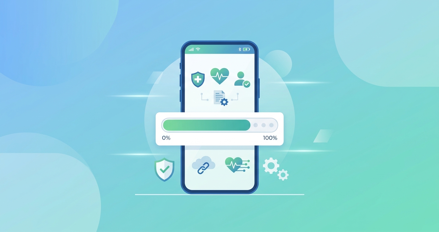
The insurance industry spent the last several years moving health assessments online, and the results have been mixed. Carriers that switched from paramedical exams to digital health assessments saw faster cycle times and lower per-case costs, but a stubborn problem emerged: digital health assessment completion rate optimization is now a top priority because too many applicants start the assessment and never finish it. The assessment loads, the applicant gets partway through, and then they're gone.
A 2025 McKinsey-LIMRA Insurance 360 Benchmark study found that while digital submission rates climbed to 84% across the industry (up from 65% in 2020), auto-decision rates only reached 20%. The gap between starting a digital process and actually completing it remains one of the most expensive leaks in the modern underwriting funnel.
Where applicants drop off and why it matters
The problem is not that applicants refuse to do digital assessments. Most actually prefer them to scheduling a nurse visit. The problem is what happens between clicking "start" and getting to the end.
Drop-off tends to cluster at predictable points. Understanding where people bail out is the first step toward fixing it. Research from Quantum Metric's healthcare analytics division and separate work by LIMRA on digital insurance journeys both point to the same friction zones.
| Drop-off point | Typical abandonment rate | Primary cause | Fix complexity |
|---|---|---|---|
| Account creation / login | 15-25% of all starters | Too many fields, password requirements, email verification loops | Low |
| Medical history questions | 10-18% of remaining | Long questionnaires, confusing terminology, fear of disqualification | Medium |
| Device permission prompts | 8-15% of remaining | Camera or location access requests without clear explanation | Low |
| Vitals capture step | 5-12% of remaining | Poor lighting, unclear instructions, failed first attempt | Medium |
| Review and submit | 3-7% of remaining | Applicant second-guesses answers, gets distracted, saves for later and forgets | Low |
The compounding effect is what kills overall rates. If you lose 20% at login, 15% at medical history, 10% at device permissions, and 8% at vitals capture, your end-to-end completion rate lands around 55% even though no single step looks catastrophic on its own.
The real cost of incomplete assessments
An incomplete digital health assessment is arguably worse than never starting one. The carrier has already paid for the digital infrastructure, the applicant has already invested time, and the agent has already set expectations. When the applicant drops off, everyone loses.
LIMRA's research on digital insurance application workflows found that the cost of re-engaging a dropped applicant is roughly three times the cost of getting them through the first time. Phone follow-ups, reminder emails, rescheduled assessments, and the occasional reversion to a traditional paramedical exam all add up.
Damco Group's 2025 analysis of life insurance underwriting technology noted that AI-powered underwriting systems had cut decision times from an average of five days down to 12.4 minutes for standard policies with a 99.3% accuracy rate in risk assessment. But those numbers only apply to completed assessments. The speed gains mean nothing if the applicant never finishes the intake.
There's also a selection bias problem that doesn't get discussed enough. The applicants most likely to drop off during a digital assessment are not random. They skew older, less tech-comfortable, and often represent larger face-amount policies. Losing them disproportionately hurts premium volume relative to headcount.
What actually moves completion rates
Talking to carriers and reviewing the available data from LIMRA, RGA, and several insurtech implementation reports, a few patterns stand out. The interventions that work tend to be boring and specific rather than flashy.
Cut the medical history questionnaire in half
Most digital health assessments ask too many questions. The original questionnaires were designed for paper forms where the applicant sat with an agent who could explain each question. Porting those same 40-question forms into a mobile interface and expecting the same completion rates is unrealistic.
RGA's accelerated underwriting research suggests that carriers can eliminate a significant portion of medical history questions by cross-referencing electronic health records (EHR), prescription databases like Milliman IntelliScript, and MIB data. If the system already knows the applicant takes metformin, asking "Do you have diabetes?" is redundant and feels invasive. The applicant wonders why you're asking if you already know.
The carriers seeing the best completion rates have trimmed their digital questionnaires to 8-12 questions that actually change the underwriting decision, and they use conditional logic so a healthy 30-year-old doesn't see the same questions as a 55-year-old with prior cardiac history.
Fix the first 30 seconds
The login and account creation step is where the most applicants leave, and it's the easiest to fix. Every additional form field at the start reduces completion by a measurable amount. C+R Research's competitive UX assessment of digital member portals across insurance types found that the best-performing portals minimized upfront data collection and deferred non-essential fields to later in the process.
What works: pre-populating fields from the agent's CRM, using magic links instead of passwords, and letting applicants start the assessment before creating an account. The account creation can happen at the end, after the applicant is already invested.
Explain device permissions before asking for them
Camera access prompts are a particular pain point for phone-based health assessments. The operating system shows a generic "this app wants to access your camera" dialog, and without context, many applicants deny it or close the app entirely.
The fix is a brief interstitial screen before the system permission prompt that explains exactly why the camera is needed and what will happen. Something like: "We'll use your phone's camera to measure your heart rate and blood oxygen. This takes about 30 seconds. Your video is processed on your phone and never stored." Carriers that added this explanatory step before the OS prompt reported camera permission acceptance rates above 90%, compared to 70-75% without it.
Make the vitals capture forgiving
Phone-based vitals measurement using camera technology (rPPG and similar approaches) works well under controlled conditions, but applicants aren't in controlled conditions. They're in their car, in a dim room, holding the phone at an odd angle, or dealing with a toddler.
The assessment needs to handle failed captures gracefully. A hard failure message ("Measurement failed. Please try again.") after 30 seconds of holding still is demoralizing. Better implementations offer real-time guidance ("Move to a brighter spot" or "Hold steadier") and allow partial captures that improve with a brief retry rather than starting over from scratch.
Send smart reminders that actually work
For the applicants who save the assessment for later and forget, the reminder strategy matters more than most carriers realize. Generic "Complete your health assessment" emails sent 24 and 72 hours later have low re-engagement rates.
What performs better: reminders that include the applicant's progress ("You're 70% done, about 2 minutes left"), reminders sent at the same time of day the applicant originally started (suggesting that time slot works for their schedule), and reminders from the agent rather than from the insurance company. The agent relationship drives action in a way that a corporate email doesn't.
How mobile-first design changes the math
LIMRA's research on mobile technology adoption in insurance distribution has consistently shown that mobile-friendly interfaces outperform desktop-optimized ones for health assessment completion. This makes sense when you think about when applicants actually do these assessments: evenings, weekends, and lunch breaks. They're on their phones.
But "mobile-friendly" doesn't just mean responsive design. It means designing the entire flow for a thumb and a 6-inch screen. Long dropdown menus become swipe selectors. Text input fields become tap-to-select options wherever possible. Progress indicators are always visible. And the vitals capture step uses the phone's front camera in portrait mode because that's how people naturally hold their phones.
Carriers that designed mobile-first and then adapted for desktop (rather than the reverse) reported completion rates 15-20 percentage points higher than those that started with a desktop form and made it responsive.
Measuring what matters
Not all completion rate metrics are created equal. The headline number (percentage of starters who finish) is useful but incomplete. More sophisticated measurement breaks the funnel into stages and tracks:
| Metric | What it tells you | Target benchmark |
|---|---|---|
| Start rate | Percentage of invited applicants who begin | Above 80% |
| Stage-by-stage drop-off | Where exactly people leave | No single stage above 15% loss |
| Time to complete | How long the full assessment takes | Under 5 minutes for standard cases |
| Retry rate | How often the vitals capture needs a second attempt | Below 20% |
| Device mix | Percentage on mobile vs desktop | Track, don't target (but design for the majority) |
| Same-session completion | Percentage who finish without leaving and returning | Above 75% |
| 24-hour completion | Including those who return to finish | Above 85% |
The carriers getting the best results track these weekly, not quarterly. Digital assessment UX degrades quietly through OS updates, browser changes, and backend modifications that nobody flags as affecting the applicant experience. Weekly monitoring catches problems before they compound.
Where contactless vitals fit in the completion picture
The shift from traditional paramedical exams to digital health assessments already removed the biggest completion barrier: scheduling a nurse visit. But within digital assessments, the vitals capture step is still where the most technical friction lives.
Camera-based vitals measurement through rPPG (remote photoplethysmography) captures heart rate, respiratory rate, blood oxygen, and blood pressure indicators using just the applicant's phone camera. No additional hardware, no wearable to pair, no bluetooth connection to troubleshoot. The applicant looks at their phone for 30 seconds and the measurement is done.
Companies like Circadify are building rPPG technology specifically for this use case, where the assessment needs to work on the first try, on any phone, in imperfect conditions. The completion rate of the vitals step depends entirely on how well the technology handles real-world variability.
For carriers evaluating digital health assessment platforms, the vitals capture completion rate is probably the single most diagnostic metric. If applicants can get through the vitals step on their first attempt without retrying, the rest of the assessment tends to take care of itself.
Frequently asked questions
What is a good completion rate for digital health assessments?
Industry benchmarks vary, but carriers with optimized flows typically see 80-90% end-to-end completion rates. The median across the industry is closer to 60-70%, which means there's significant room for improvement at most organizations. The gap between median and best-in-class is almost entirely explained by UX decisions, not by the underlying technology.
How long should a digital health assessment take?
Under five minutes for a standard-risk applicant. Anything longer and completion rates drop sharply. The best implementations finish in two to three minutes by using pre-populated data, conditional question logic, and fast vitals capture. If your assessment routinely takes more than seven minutes, the questionnaire is almost certainly too long.
Do older applicants complete digital assessments at lower rates?
Yes, but the gap is smaller than most carriers expect. Applicants over 55 complete digital assessments at rates roughly 10-15 percentage points lower than those under 40, mostly due to the device permission and vitals capture steps. Clear instructions and larger UI elements close much of that gap. The bigger predictor of completion isn't age but whether the applicant has done any kind of health app interaction before.
Should carriers offer a fallback to traditional exams?
Some carriers offer a phone-based assessment with a live guide as a middle option between fully self-service digital and traditional paramedical exams. This hybrid approach captures applicants who would otherwise drop off while still avoiding the cost and delay of a nurse visit. It is worth offering for high-face-amount cases where the premium justifies the extra support cost.
You can read more about the applicant experience in digital screening and how self-service health assessments replace nurse visits elsewhere on this site.